

Throughout the course of digital design, there has been many design trends and styles that have been produced. From muted colour palettes to abstract illustrations, the User Interface (UI) trends are constantly evolving to keep up with digital enhancements. However, one area that has been largely neglected is that of Digital Accessibility.
When creating digital content, designers and developers must not overlook the diverse range of potential users that could be interacting with their system. Digital Accessibility ensures that your website or system is configured so that individuals who have auditory, speech, visual, motor, or cognitive impairments can interact.
According to the World Health Organisation, around 15% of the world’s population live with some sort of impairment, with 2-4% experiencing significant difficulties in functioning.
It is vital when creating digital designs to consider individuals with impairments and, where possible, to make your designs more accessible and user-friendly. Focusing on Digital Accessibility can result in reaching a larger audience, generating better search results and encourage good coding practice as the site has better usability.
So, what are the areas that you need to focus on?
Colour Contrast
The first commonly overlooked area is colour contrast.
Individuals who have low vision or colour blindness can find it extremely difficult to read content if the contrast with the background is low.
Globally, there are at least 2.2 billion people who have a vision impairment or blindness. It is, therefore, critical to consider such a simple thing as colour contrast between text and its background. According to W3C, the visual presentation of text, and images of text, should have a contrast ratio of at least 4.5:1. But what does this mean?
The contrast ratio indicates how easy and clear is it to see your text/image compared to the background that they are found on.
An easy way of checking this is using WebAIM’s Contrast Checker. Enter your foreground and background colour and the overall contrast ratio of your colour choices will be displayed. The checker will also summarise how your contrast fares in the areas listed below.
- Normal Text (the general text on a page)
- Large Text (titles and bold text)
- Graphical Objects and User Interface Components (images and text boxes)
When deciding on colours, you also need to remember that only a small number of colours work on both a dark and light theme. For example, if you use a ‘Blue Style’ on both a dark and light theme, the blue colour must vary in lightness to accommodate a successful contrast ratio.

Support Keyboard Navigation
One of the most critical aspects of Digital Accessibility is Keyboard Accessibility.
Individuals with motor disabilities or a lack of precise motor control, visually impaired users, and power users (someone who frequently uses the advanced features of a computer) are dependent on the use of the keyboard or voice to navigate. Therefore, the first area that needs to be addressed to improve Keyboard Accessibility is the incorporation of focus states as indicators.
Focus states are the blue boxes that highlight an area when navigating around a page. Browsers by default use a CSS pseudo-class to show these outlines on elements when they are selected. They can be customised to suit and complement the designs of your website; however, they must be clearly visible and have accessible colour contrast.

Not only do you need to see where you are navigating, but you need to ensure there is the correct structure. The order of the interactive areas must have a logical route and the tab order should follow a visual flow of the page. (For example, header, main navigation, body content, and footer).
Try to shorten the length of your navigation options and limit the number of links on a page. Tabbing or listening to long lists of links can be straining and tiring for those who have motor disabilities or visual impairments.
Finally, providing HTML5 structural elements or ARIA Landmarks will make navigation a lot easier.
Use Correct Markup Language
Markup languages are tags that are given to text to help define its purpose. They assist the user with navigation and interactions when using your website.
To make the markup language as simple as possible, it is key to keep HTML code semantic. But what does this mean?
Well, semantic HTML basically means that you use the correct HTML elements for their correct purposes. For example, make sure you use a h1 tag for the main heading instead of a div tag. The same goes for a button or general paragraphs (p) that you find throughout the content. These elements communicate to the browser the styling of the page, and structure and arrange the accessibility tree. This tree is what powers screen readers so that people can navigate through the page by listening to its structure.
Label Clearly
You should try and make your designs as intuitive as possible, but sometimes assistance will be required.
Form fields and inputs are a key example of where labelling can help the user, as a guide may be used to inform the user what details they should enter.
Even though labelling should be fairly straight forward to get right, it’s easy to fall into ‘design traps’.
A new trend when screen real estate is limited or simplicity is the main goal is incorporating placeholder text as the labels for the forms. Although the placeholder text may look clean, it could cause a number of issues for those with visual impairments. Placeholder text is usually grey or has a low contrast to indicate where data should be entered, which makes it more difficult to read. Even if the user can read the placeholder text, once the user starts inputting data, the label will disappear.
It’s important that users don’t lose the context, or their understanding of the context, when entering information.
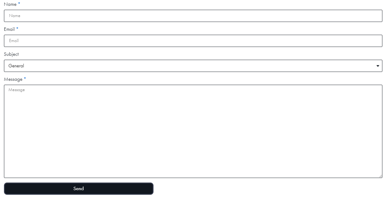
Using informative labels doesn’t mean that you have to overload your forms and designs with unnecessary information. You simply need to make sure you provide essential cues and guides, where needed.
Displaying the right information doesn’t only apply to labels.
Those that rely on screen readers may need to hear everything on the web page. To increase inclusivity, alternative text should be applied for image and non-text content.
Applying an attribute to an image will allow it to be picked up by screen readers. Adding a description of the image and how it is relevant to the information displayed on the page, can help aid the audible flow of your website. If these alt tags are left blank, some screen readers will read the file name to the individuals, which can cause confusion.
Conclusion
Digital Accessibility should always be at the forefront of all design decisions, ensuring that you allow an equal opportunity for your diverse users to understand and interact with your websites and tools.
